Rutherford Thrives
We worked with this Murfeesboro, TN-based collective to build a visual system that authentically represents their ongoing mission.
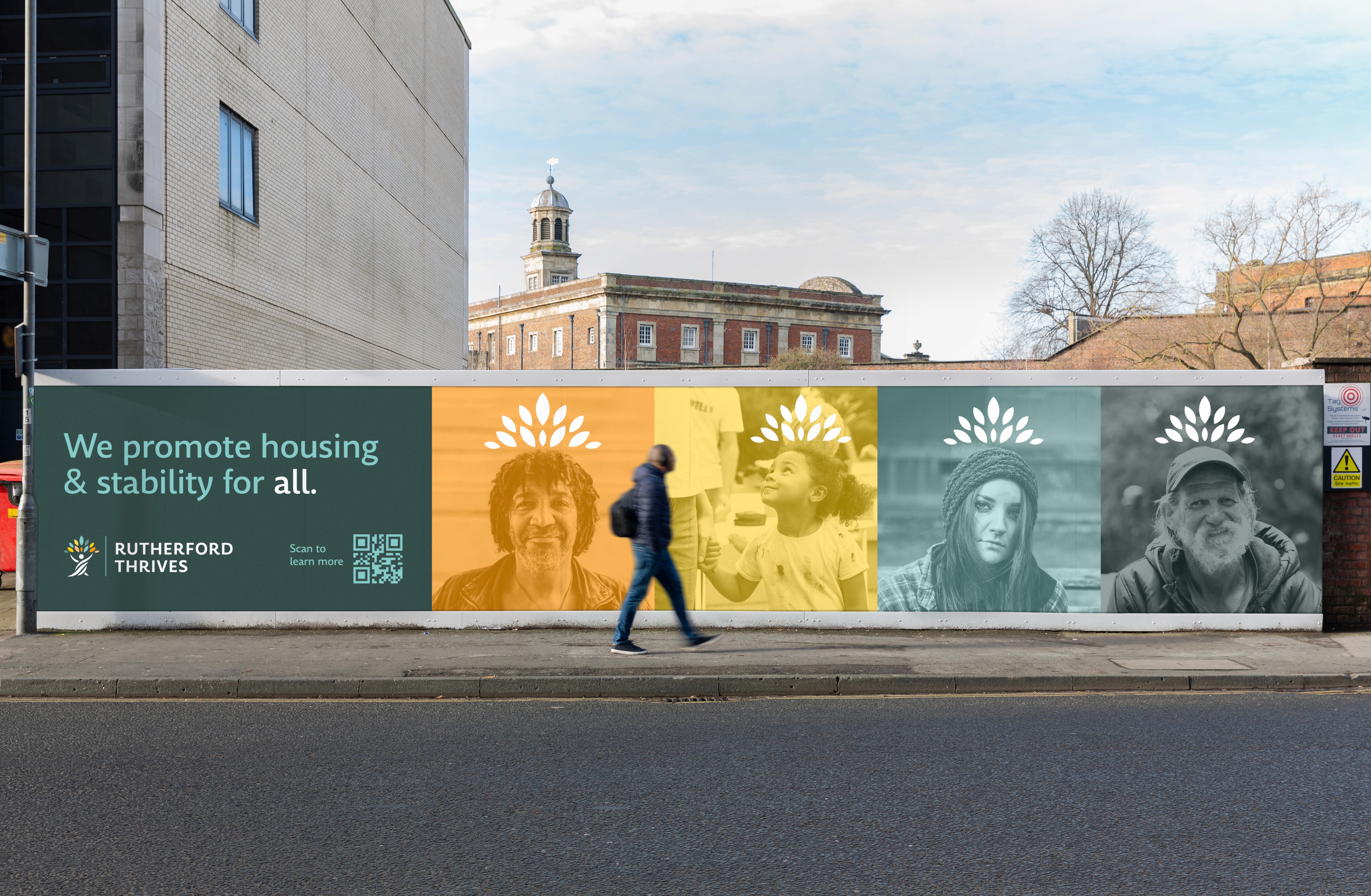
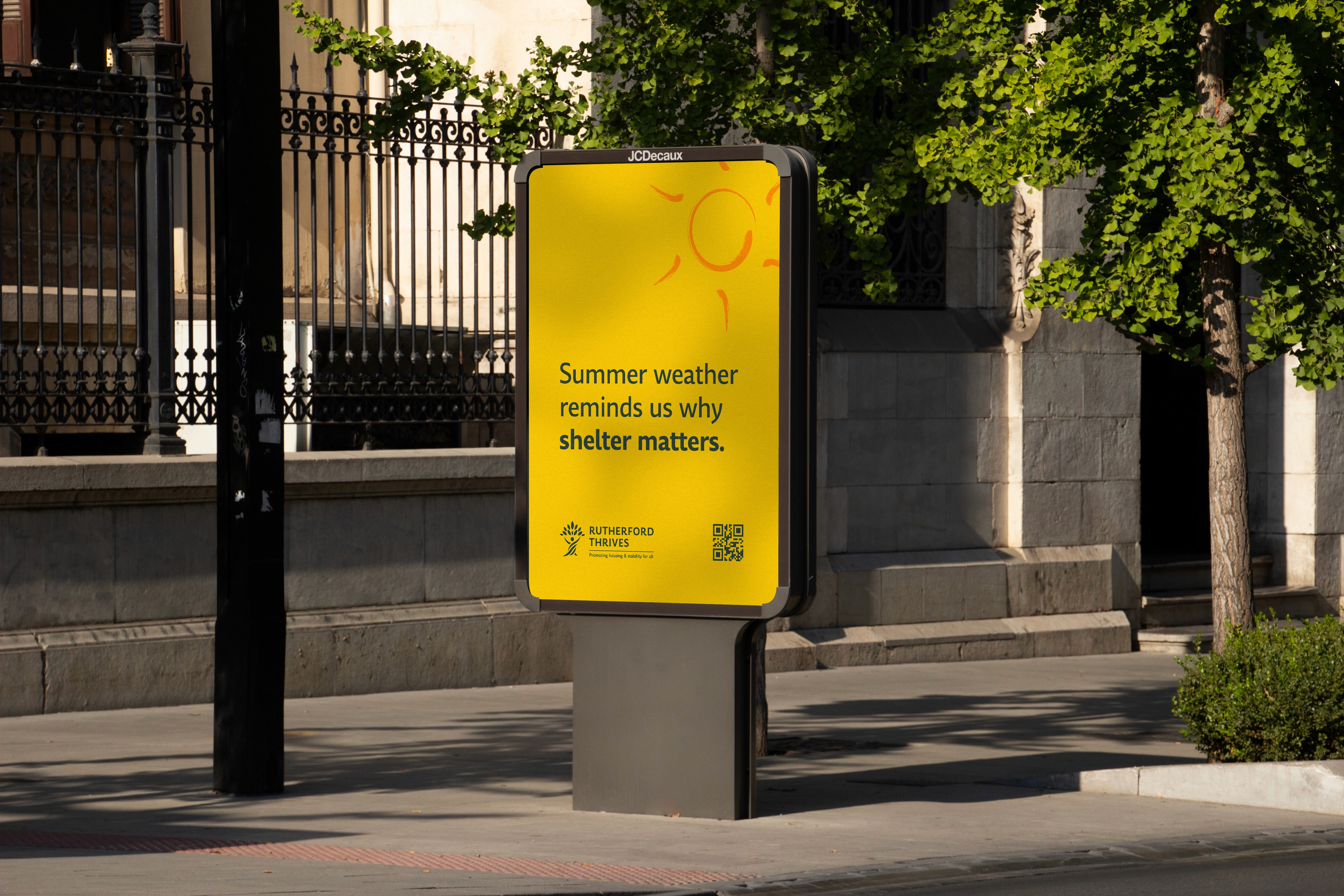
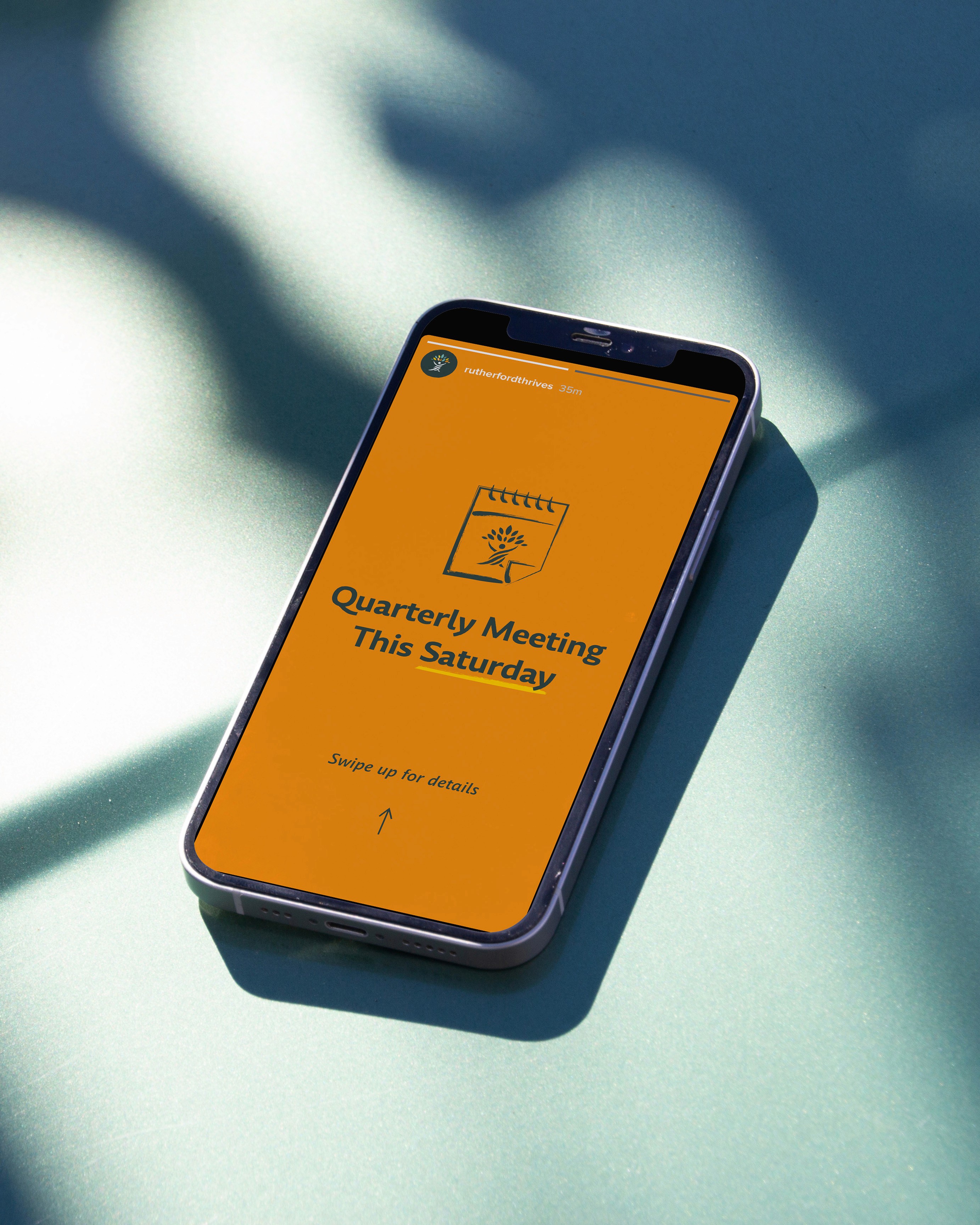
The brand's advocation for the unhoused, called for warm and trustworthy visual themes. This manifests itself through the friendly and organic colors as well as the humanist sans serif type. Hand drawn iconography support the idea that people are the "why" of this collective.
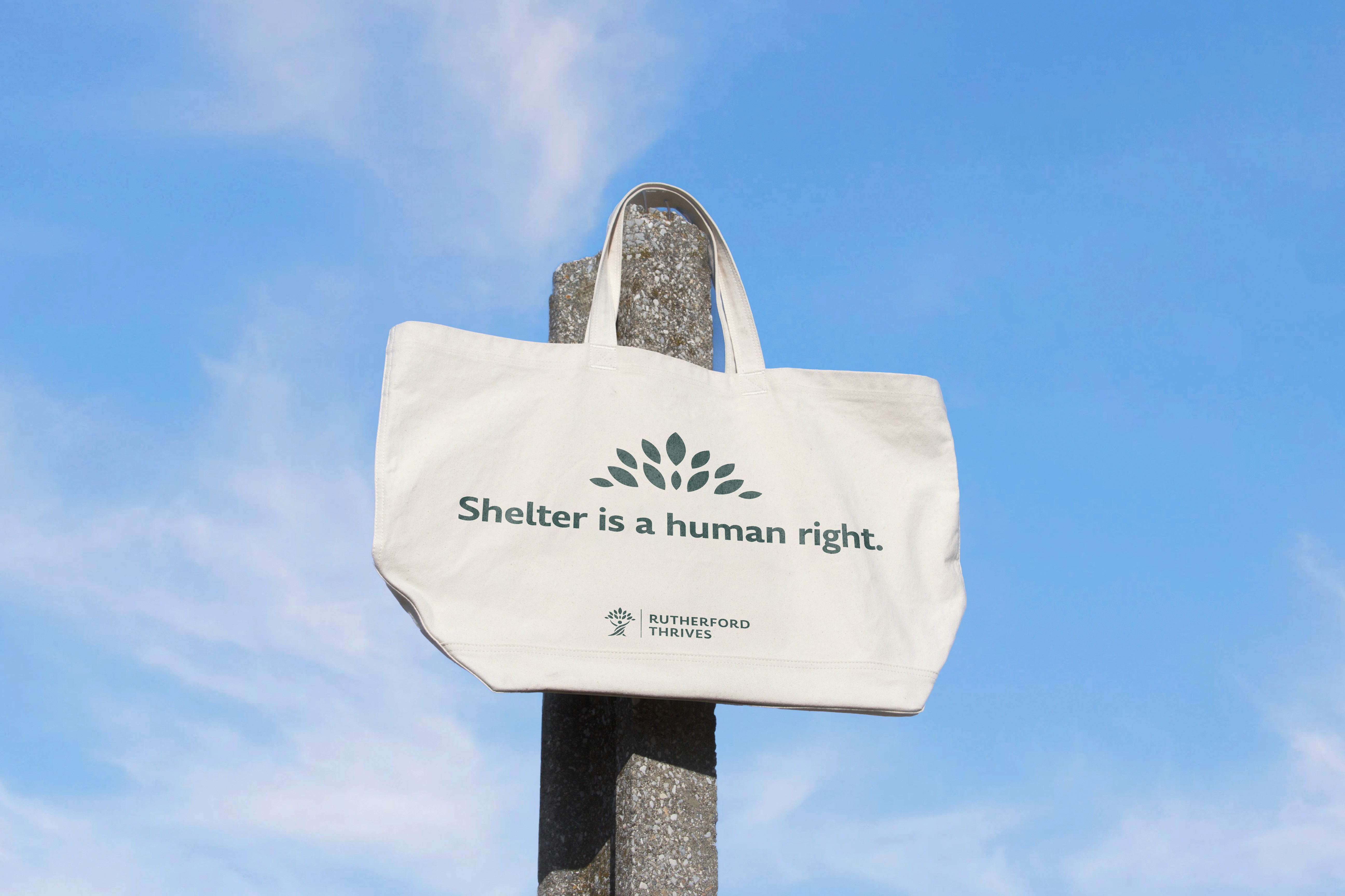
The "canopy" icon is a dynamic visual element that detaches from the main logos. It's intended to be a visual metaphor of the brand's mission of "shelter" that can applied to many instances.
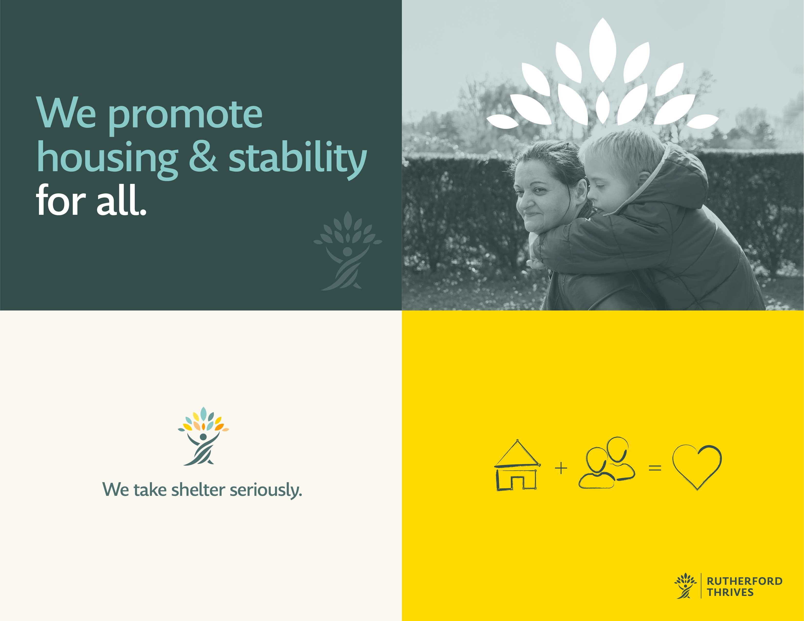
As mentioned, the visual system is crafted to be warm and trustworthy. Themes of growth, development, shelter, and thriving lives inspired every decision – from the abstracted tree human figure to the floral-inspired accent color names.